Who was Roger Broders? The illustrator who glorified 1920s France
Roger Broders, a self-taught Parisian painter, created between 1922 and 1932 the finest series of travel posters ever made for the Paris-Lyon-Méditerranée railway company. Discover his story, his style, and why his work still shapes French poster art.

Key points
- 60 posters in the French Riviera posters collection, the 20 from this article in the table below.
- From $19.00 in A4, up to $74.00 in A0, 5 sizes for each poster.
- Printed in the United States on demand, free delivery from $69.
The table
The 20 posters at a glance


Roger Broders (1883-1953) remains one of the greatest French illustrators of the 20th century, and yet his name has stayed discreet. He is the artist behind most of the iconic PLM posters that sold the French Riviera, the Alps and Provence to Parisians in the 1920s and 1930s.
Pure Art Deco style, airy vertical compositions, restricted but saturated palettes. Broders created posters that stayed in your memory after a single stroll along rue de Rivoli. His “Côte d’Azur, sports d’hiver” of 1929 and his “Mont-Blanc par le chemin de fer du Fayet-Saint-Gervais-Chamonix” have become icons of French tourism.
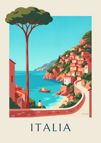
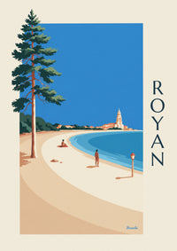
Our catalog pays tribute to this graphic heritage. See our mountain posters or French Riviera posters, directly inspired by his work.
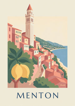
To bring the landscapes of the South into a modern decor, discover Brunelia’s Provence posters. These contemporary illustrations are not presented as reproductions of works by Roger Broders.
Roger Broders, the illustrator who made 1920s France shine
If you love posters that evoke train journeys, the mistral wind and the kind of vacations people took before the neon seaside of the 1980s, then you already know Roger Broders, even if you don’t realize it. He drew the images that still decorate Pinterest boards, decor magazine covers and most of the interiors where people like to cultivate nostalgia for the old French Riviera.
Roger Broders never attended an official fine arts school and never chased medals. Between 1922 and 1932, he simply created the most beautiful series of travel posters ever made for the Paris-Lyon-Méditerranée railway company.
His origins: a Parisian painter trained in the school of observation
Roger Broders was born in Paris in 1883. His family was far from aristocratic. His father was an employee and his mother kept house. Young Roger drew from an early age, like many children of his time who saw the illustrations in the popular press as their only window onto faraway lands. As a teenager, he frequented the open studios of Montparnasse, then the Académie Julian, never staying long. He learned by looking, by copying, by wandering through the Salon d’Automne exhibitions where the Fauves were making their mark, those painters who dared to paint a sea red and a mountain purple.
This lack of academic training would later become his strength. With no dogma and no school, Broders kept a fresh eye. He looked at a French Riviera landscape the way one looks at a show poster, seeking its effect rather than its fidelity. This pragmatic way of seeing the landscape would shape his entire body of work.
1922-1932: the golden age of the PLM posters signed Broders
In 1922, the Paris-Lyon-Méditerranée railway company was looking for an illustrator who could fill Parisian train stations with color and promise. Seaside and Alpine tourism was beginning to open up to more people. The bourgeoisie took the train to Cannes, and workers began to dream of the sea. The PLM needed images that made people want to leave.
Broders signed his first contract. The PLM’s head of communications gave him almost total freedom, on one condition: the posters had to be legible from 20 meters away in a train station. It was a demanding brief: it needed a scene, a title and an emotion, all at a glance.
Broders met this constraint with a very modern method: simplify without impoverishing. He broke the landscape into large flat areas of color, removed unnecessary details, kept one stylized figure and played with contrast. His skies are often a single color and his seas almost free of waves. Yet each poster tells a complete story.
From 1922 to 1932, he designed around a hundred posters for the PLM. Cassis, Marseille, Sainte-Maxime, Bandol, Saint-Raphaël, Antibes, Monaco, Sospel: every stop of the Blue Train passed through his brushes.

The Broders style: geometry in the service of travel
When you look at a poster signed Broders, you notice 3 things at once.
The palette. Broders loved terracotta, ochre, deep blues and olive greens. His French Riviera is never the turquoise blue of modern postcards. It is a darker, almost matte blue that catches the light. This terracotta and midnight blue palette is part of the DNA of the French poster, and we draw direct inspiration from it.
The composition. Broders framed his scenes like a photographer today. He often places a figure in the foreground, back to us, gazing at the landscape. In cinema, this technique has a name: the invitation shot. The viewer projects into the figure and looks at the landscape over their shoulder. It is exactly the effect you want when you hang a travel poster at home: to be transported.
The stylization. Broders is not quite Art Deco, nor quite Art Nouveau. He invents a supple geometry in which the curves of the hills and the roundness of the bays play against the verticals of the cypress trees. His palm trees have an almost heraldic silhouette. His villas are never detailed: 3 windows, a tile roof, a balcony, and you have Bandol or Cassis beyond any doubt.

Iconic destinations signed Broders
The French Riviera, his favorite territory
If Broders is known worldwide, it is first of all for his Mediterranean posters. Cassis and its white calanques, Bandol and its harbor full of sailboats, La Ciotat and its red cliffs, Sainte-Maxime and Saint-Raphaël: each time, Broders finds the angle that defines the town. For Cassis, it is the pine groves above the cape. For Bandol, it is the perspective between the sailboats and the pink villas along the quay.
This way of defining a town with a single framing can be found today in all the French Riviera posters that follow the PLM aesthetic. It has become a shared visual language.
The Alps, his vertical playground
Broders also drew the mountains extensively. His posters of Chamonix, La Clusaz, Megève or the Three Valleys show a sport that was still elitist: pre-war skiing. We see slender figures in jacquard sweaters gliding down pristine slopes. The palette changes: glacier blue, white, shadow purple, ski-wear red.
Brittany, a land of experimentation
Less well known, his Brittany posters for the Compagnie des Chemins de fer de l’Ouest are among his most inventive. For the coasts of Finistère or the pardons of Plougastel, he sometimes sets aside the saturated Mediterranean colors for monochrome shades of gray and deep blue.

Why Roger Broders still fascinates us today
Nearly 100 years after his first PLM posters, Roger Broders is reproduced more than ever. His originals sell at auction for between €5,000 and €25,000 apiece.
First, his palette is timeless. Terracotta, ochre, deep blue and cream never go out of style. These colors work with almost any interior.
Second, his stylization remains legible. Where the photo posters of the 1980s are dated by their resolution and garish colors, Broders’ illustrations keep their graphic power.
Finally, his subjects still speak to us. Cassis, Bandol, La Ciotat and Marseille are still there. The calanques are still white. A Broders poster is a promise of continuity.

How to bring the Broders spirit into your home
3 concrete ways to invite that spirit into your space.
1. Design a travel wall with 3 PLM posters. Choose 3 destinations that tell a personal story: your childhood vacations, your home region, your honeymoon. Use A2 for the central piece and 2 A4 posters on the sides, 5 cm apart. The eye travels from left to right as in a story.
2. A single XXL poster above the sofa. A1 or larger. Choose a poster whose colors echo a shade in your living room, a cushion, a rug, a curtain. The effect is immediate: the room gains depth without feeling cluttered.
3. In a kitchen or entryway, a themed mini-gallery. 3 or 4 A4 posters from the same region, for example Provence with lavender, olive groves and hilltop villages, create an immersive world without overwhelming the room.
If you feel like bringing the Broders spirit home, browse our French Riviera, Provence, Brittany and French cities collections. Each illustration was designed in the tradition of the great travel poster artists.
To prepare your order, check the dimensions on the page of the poster you choose, as well as our shipping terms and our return policy.

Build this wall
3 posters from this article, at true scale


All 3 posters: $106.00
Frequently asked questions
You often ask us
Who was Roger Broders?
Roger Broders (1883-1953) was a self-taught Parisian illustrator who created around 100 posters for the Paris-Lyon-Méditerranée railway company between 1922 and 1932, becoming the acknowledged master of French Art Deco travel posters.
Which destinations did Roger Broders illustrate?
Mostly the French Riviera (Cassis, Bandol, La Ciotat, Sainte-Maxime, Saint-Raphaël, Antibes, Monaco), the Alps (Chamonix, La Clusaz, Megève) and Brittany. About 100 PLM posters in total between 1922 and 1932.
What is Roger Broders’ signature color palette?
Terracotta, ocher, deep blue, cream and olive green. A terracotta and midnight blue palette that defines the DNA of the French poster and runs through the PLM visual language.
How much are original Roger Broders posters worth today?
Originals sell at auction for between €5,000 and €25,000 each depending on condition and rarity. His popularity has kept growing since the 2000s.
How can you bring the Broders style into your home?
3 ways: a gallery wall of 3 PLM posters (1 A2 + 2 A4), one XXL poster above the sofa, or a themed mini gallery in the kitchen or entryway with 3-4 A4 prints from the same region.
Keep exploring